 Yes, that would be .5 degrees Fahrenheit, as in 1/2 tick above zero.
The night is young...it will be below zero shortly.
 Party? What party? I'm trying to figure out some new ads to get some visitors to my new and improved ArtFire Studio. I figure if I try enough ideas, one or two will end up working when they are published. What do you think? Which do you like best? Tried to keep them tiny like they will eventually be seen! And the burning question...where are good places to PUT them?!
No it's not an interactive image but if you feel like putting on your art critic's cap, and telling me what you think, I'm all ears! So much for a "wordless wednesday" not....
Thanks for dropping by & keep warm!


8 comments:
Have you been featured on any product review/giveaway blogs yet? That's a good way to increase awareness of your artfire shop and drive traffic to it (if done well).
I'd be happy to work with you on my blog for a review/promotion - just let me know if you're interested :)
I'm drawn to the solid color ads, especially the blue at the bottom center. I like simple, easy-on-the-eyes kind of ads and the ones with multiple colors seem too busy. Just my opinion--I'm sure others will differ.
1. I am scared of that temp reading!
2. It's so nice you have a tropical corner in your house with bright lovelies to take you away from winter!
3. I've been LIVING off of butternut squash soup in the past few days..mmmm.
4. Ads- I do have a pw account. It's nice but I don't think that ultimately it drives in that much traffic. I'm gonna do a bit of research in the next few weeks about blogs I might want to place an ad with...I'll let you know if I come up with anything good.
5. I think the blue silk crochet bracelet at the bottom really jumps out at me- the placement is just right. It does kind of sum up the look of your work too. Just my 2 cents:)
I can't really make out the little ads- so the ones with the most color are what draw my eye - there are a few with light colored-stones and they just don't stand out at all -
Love those flowers!
Soup sure does sound good right about now. But then so does living in the tropics. The flowers are gorgeous.
As for the ads the ones that appeal to me the most are both on the bottom, the one in them middle and the one on the right. The blue one simply because I love the color the other because I was drawn to the way the chain is laying. It just appealed to me
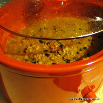
Bean and barley sounds yummy- are you going to share?
Wish I could have you all over for soup!! My new crock pot is pretty big and so I accidentally made A LOT!! It's good, but I bet I'll get tired of it....
great photos and flowers! love it!
Post a Comment